

#178 A Picture of Healthy Ageing
Healthy Ageing

Life follows an unstoppable pattern. It is a journey we travel only once but it has a known end point. The good news is that the journey is easier. We are ageing more healthily.
A Five-Minute Read
The World Health Organizations has a definition of ageing:
“The accumulation of damage to cells and tissues in the body and the resultant gradual deterioration of bodily functions”.
We cannot hold back the onset of disability and eventual death. It is a cumulative process. We will have a period at the end of our lives when we lose the ability to live normally. This is a period of frailty. The good news is that all the data suggests that as the length of our lives extends, that period does not grow as much. We are blessed instead with an increasing period of relatively healthy living.
Healthy Ageing Span
To try to come up with a metric the United Nations combined data on death and diseases. They can computed a “healthy ageing span” and “years lived with disability”. Between 1990 and 2016, global life expectancy went up by seven point four years. Eighty five percent of the added years were “good” or healthy aging years. The figures for most countries are the same. For example, life expectancy in the UK went up by just over five years. Nearly ninety percent of them were “healthy ageing” years.
The Frailty Index
There are many different measures that reflect the build-up of the deficits of biological ageing. They can be physical like the measures of everyday activity. They can be mental. A “frailty index” is made up of a collection of them. It tracks the onset of frailty. A recent paper provided a beautiful graphic that encapsulates “healthy ageing”:
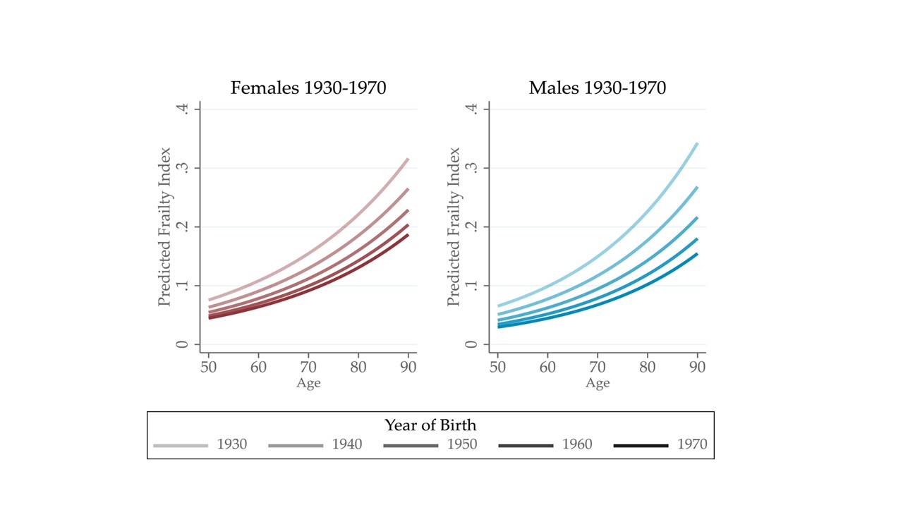
Source: Old, J.; Scott, A. (2023), “Healthy Ageing trends in England between 2002 to 2008: Improving but slowing”, The Journal of Economics and Ageing.
Using data from a large UK longitudinal data set they charted the build-up of frailty with age. If we look at a single line on either chart the curve grows relatively slowly but then accelerates as we reach 80 or 90. Frailty builds over time. For some it starts in early life. For many it comes with older age. The onset of a chronic disease, like diabetes, is a typical event.
Why are there multiple lines on each chart? What the analysts did is to fit the curve for different “cohorts” or generations. The palest curve shows a generation of people who were born in the 1930’s. Their curve is now nearly complete since many are now in their 90’s. Their frailty index today is above 0.3. The generation born in the 1940’s are moving up a different curve. Their period between 80 and 90 is a forecast. For later generations more and more of the curve is a forecast.
The curves are not the same and the difference is the impact of healthy ageing. Compare the frailty indices at the same age but for different generations. The earlier generation always has a higher index. They are ageing less healthily. The effect is the same for each generation or cohort as the curves “march to the right”.
When someone is born is as important as their chronological age. My father was born in 1918, before this data and analysis was available for the UK. We do know that when he was my age, he was much frailer than I am today. There is comparable evidence from the US. The 1920 cohort at age 65 had a frailty index of 0.21. That same deficit will be not shown by the cohort born in the 1950's until the age of 82. That is a 17-year improvement in biological age in thirty years. That is a single generation, my generation.
The Diversity of Healthy Ageing
I am sure that you will have spotted the differences in the curves between men and women. Women have a higher frailty index at almost any age than men. They age less healthily. There are many other differences in the curves of different groups. The paper looked at the impact of deprivation. If you live in an area of deprivation your life expectancy is lower. They showed that your healthy ageing suffered as well. People living in deprived areas do not get a healthy ageing benefit. Their curves are not moving to the right.In the US the same split happens by race.
Less obvious from the graphs is the decline in the rate of improvement. Life expectancy is still improving. However it is not improving at the same rate as it once was. Medicine is running out of places for “easy wins”. The same is true for heathy aging. The curves are still “marching to the right” but not as fast.
History is a Poor Guide
It is easy to forget just how quickly life has extended. How healthy ageing has become the norm in most developed countries. My father’s life expectancy when he was born, in the UK, was less than 60. If we want to understand our own ageing, then history is a poor guide. Thinking of what your parents could do at your age is not helping. Despite this many of the stereotypes we hold of “being old” come from history. The generations in the past were on different curves to you. We are all ageing on our own curve.
If you enjoy the Newsletter please recommend it to friends and send them to Substack to subscribe. It is free. Alternatively try the button below. All the Newsletters and lots more background is on my website thebusinessofage.com